
How to Make Your Invoices Look Professional
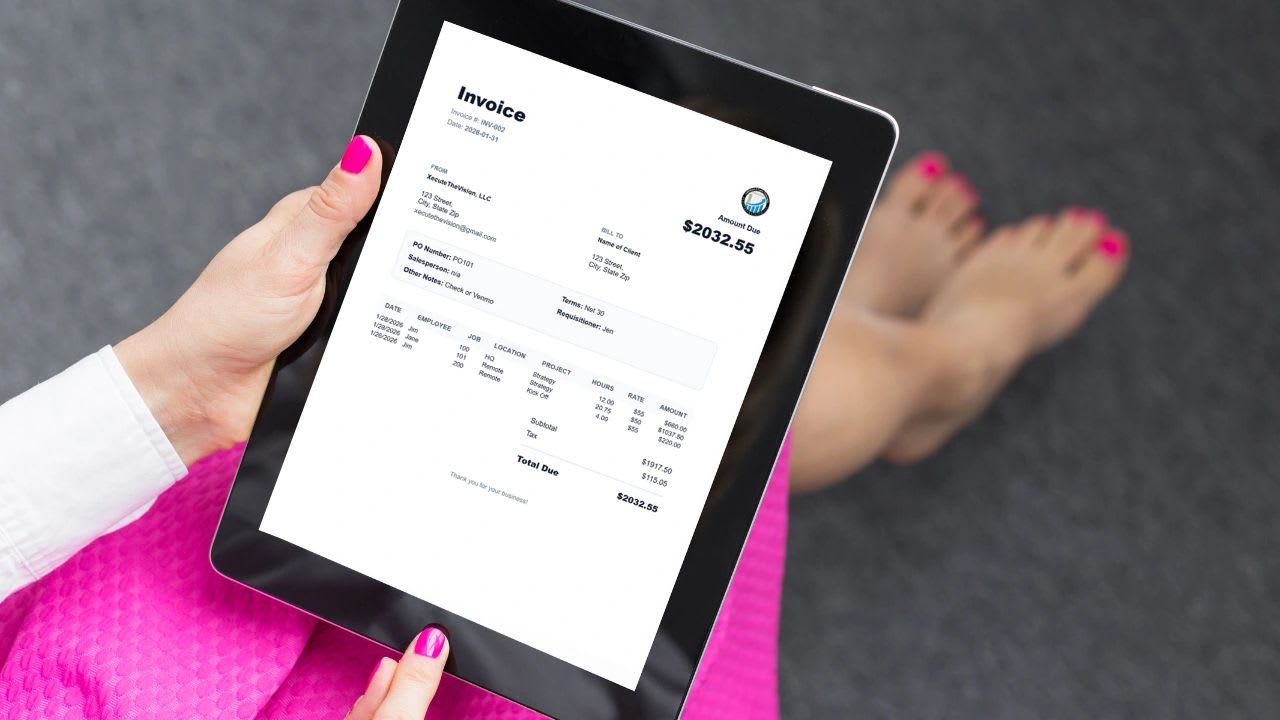
How to make your invoices look professional matters more than most owners think, because an invoice is not just a bill. It is a brand document, a trust document, and one of the last things a client sees before they decide how quickly to pay you.
Most small businesses send invoices that look rushed, cluttered, or homemade. The good news is you do not need a graphic designer. You need structure.
Below are the ten questions owners ask most about professional invoices, a sample layout, the details that speed up payment, and a free checker that scores your current invoice and tells you what to fix.
1. What Makes an Invoice Look Professional?
Professional invoices have five things in common. They carry clear branding, so the client knows instantly who sent them. They use intentional spacing, so the page is easy to read. They show transparent totals that anyone can check in a few seconds. They include the reference fields that businesses rely on, such as a PO number and payment terms. And they arrive as a clean, consistent PDF that looks the same on every screen and printer.
If any one of those five is missing, the invoice starts to feel homemade, even if the work behind it was excellent. The sections below take each one in turn and explain what it looks like in practice, so you can compare your current invoice against it and fix whatever is holding it back.
2. How Important Is Branding on an Invoice?
Branding is extremely important, because the client forms an impression before they read a single number. In the first glance, your invoice should answer three questions: who is this from, is this business legitimate, and does this company look organized? Good branding answers all three without the client having to think about it.
Logo Placement
Your logo should be visible but not overpowering. Placing it in the top left or top right corner is standard, and it is where clients expect to look. A logo that fills half the page feels like an advertisement, while a tiny one buried in the footer is easy to miss, so aim for a size that is clearly readable and leaves plenty of room for the invoice details.
Company Information
Include your business name, address, email, and a phone number if clients are likely to call. Stack these details neatly in one block, usually beneath or beside your logo, rather than scattering them around the page. When a client or their accounts payable team needs to contact you or enter you as a vendor, everything they need should be in one place.
Consistent Font and Colors
Use one clean, readable font throughout, and avoid script or decorative fonts that are hard to read at small sizes. Choose one brand color and use it sparingly, for example on the heading or table header, so it looks deliberate rather than loud. You do not need gradients, shadows, or special effects. You need clarity and consistency, and professional design is usually simpler than people expect.
3. How Should an Invoice Be Structured?
Professional invoices follow a logical visual hierarchy that leads the reader from the top of the page to the amount due. The header comes first, with the word "Invoice," the invoice number, and the dates. Below it sit the From and Bill To sections, so both parties are identified. Next comes a row of details such as the PO number, payment terms, and the salesperson or account manager. The line items table follows, then the totals, and finally a short footer with payment instructions and a thank-you.
The biggest mistake people make is crowding all of this together until the sections blur into each other. When each block has its own clear space, the client can find what they need instantly. The table below shows what belongs in each section.
| Section | What Goes In It |
|---|---|
| Header | The word "Invoice," invoice number, invoice date, due date |
| From and Bill To | Your business details on one side, the client's on the other |
| Details row | PO number, payment terms, project name, account manager |
| Line items | Description, date, hours or quantity, rate, amount |
| Totals | Subtotal, tax, deposit or credits, total due |
| Footer | Payment methods, a short thank-you, contact for questions |
4. Why Does Spacing Matter So Much?
Spacing communicates confidence. When an invoice is tight, cluttered, and compressed, it signals disorganization, rushing, and inexperience, even if none of those things are true. The client may not consciously notice the spacing, but they feel it, and it colors how they see the rest of the document.
Professional invoices use generous margins around the edges of the page, clear separation between each section, a little white space between line items so the eye can follow each row, and breathing room around the totals so the amount due stands on its own. White space is not wasted space. It is structure, and it is what makes a busy page feel calm and easy to check.
A good test is to look at your invoice from arm's length. If it feels like a spreadsheet printout, with every cell pressed against the next, it is time to fix the layout.
5. How Should Line Items Be Displayed?
Your line items table should be clean and easy to scan. The right columns depend on your business, but common ones include the date of the work, the employee who did it, the job, location, or project it belongs to, the hours or quantity, the rate, and the amount. Include the columns your clients actually need to match the invoice against their own records, and leave out the rest.
A few layout habits make a big difference. Align numbers to the right so the digits line up and totals are easy to check, and keep text aligned to the left. Use consistent column widths from row to row, and avoid descriptions that wrap awkwardly across three or four lines. When the numbers are easy to scan vertically, a client can verify the math in seconds, and a client who can verify the math trusts the invoice. If they cannot, they lose confidence and start asking questions.
The description column matters most of all. Compare the weak line items on the left with the professional ones on the right.
| Weak Line Item | Professional Line Item |
|---|---|
| Work completed, $1,200 | Kitchen cabinet install, 16 hours at $75, $1,200 |
| Consulting | Operations review workshop, Mar 4, 3 hours at $150, $450 |
| Materials | Oak trim, 40 linear feet at $6.50, $260 |
6. What Should the Totals Section Look Like?
The totals section is the most important part of the invoice, because it is the part the client acts on. It should clearly show the subtotal, any tax, any deposits or credits already paid, and the total due, each on its own labeled line.
What makes a totals section look professional is placement and emphasis. Right-align it so it sits beneath the amount column, separate it slightly from the line items above, label each figure clearly, and make the final total bold. The total due should stand out visually without shouting. If it blends in with every other number, the invoice lacks hierarchy and the client has to hunt for it. If it is oversized and flashy, it looks desperate. Balance is what you are after.
7. Should You Include PO Numbers and Terms?
Yes, especially if you work with corporate clients. Many companies run every purchase through a purchasing process, and their accounts payable team cannot release a payment until the invoice matches a purchase order. An invoice without the PO number often sits unpaid while someone tracks it down.
Professional invoices often include a PO number, payment terms such as Net 15 or Net 30, the salesperson or account manager, the requisitioner who ordered the work, and a notes field for anything else the client needs. Adding these fields signals operational maturity. It tells your client that your business understands structured procurement, and even if you are a small company, it lets you present like a larger one. That positioning matters when clients are deciding whom to trust with bigger projects.
8. How Should the PDF Be Formatted?
This is where most people get it wrong. A well-designed invoice can still look unprofessional if the PDF prints with the edges cut off, scales strangely, breaks across pages in awkward places, shifts downward when opened on a phone, or has margins that change from one page to the next. Any of those problems instantly undermines everything else you did right.
A professional invoice PDF fits on one letter-size page whenever possible, keeps consistent margins, and looks the same whether it is viewed on screen, downloaded, or printed. It should also hold its formatting across devices, so the version your client opens on a phone matches the one you saw on your desktop. If your mobile-generated PDF looks different from the desktop version, fix it before you send another invoice. Consistency is what builds trust.
9. Should You Add a Footer Message?
Yes, but keep it simple. A short line at the bottom, such as "Thank you for your business," "We appreciate the opportunity to work with you," or a reminder like "Payment due within 30 days," adds a human touch to what is otherwise a financial document.
Center the message and keep it subtle, in a smaller or lighter font than the rest of the invoice. The goal is to humanize the invoice without turning it into a marketing email, so skip the promotions and keep the footer to a sentence or two alongside your payment instructions.
10. Can You Really Do All This Without a Designer?
Yes. Everything in this guide comes down to a structured template, clean typography, proper spacing, logical sections, and consistent formatting, and none of those require design training. Once you set up a good template, every invoice you send inherits the same polished look automatically.
Professional design is not about decoration. It is about clarity, and clarity is something any business owner can achieve with the right template and a few minutes of attention to the details above.
Free Invoice Professionalism Checker
Free Invoice Professionalism Checker
Open your most recent invoice and tick everything it already does. The checker scores it out of 100, shows which area needs the most work, and lists exactly what to fix. Nothing you enter is saved or sent anywhere.
Fix These First
Common Invoice Design Mistakes
Most unprofessional invoices suffer from the same handful of problems. The table below shows each one, why it hurts, and the quick fix.
| Mistake | Why It Hurts | Fix |
|---|---|---|
| Everything crammed together | Looks rushed and hard to check | Add space between sections and around totals |
| Several fonts and colors | Looks homemade | One font, one brand color |
| Vague line items | Clients ask questions before paying | Describe exactly what was done and when |
| Total hidden among other numbers | The amount due is easy to miss | Bold, right-aligned total with a clear label |
| No due date | Payment slides to the bottom of the pile | Show the actual date, not just the terms |
| PDF that breaks on mobile | Looks unreliable | Test it on a phone before sending |
Details That Get You Paid Faster
A professional look builds trust, but a few practical details also shorten the time between sending an invoice and getting paid. Show the actual due date rather than just "Net 30," because clients schedule payments by date, not by counting days. Offer more than one way to pay, such as ACH, card, or check, and include clear instructions for each so nobody has to email you to ask.
Timing matters just as much as design. Send the invoice the day the work is done, because invoices sent weeks later tend to get paid weeks later. Include a name and contact for questions, so a small issue with one line does not stall the whole payment. And number your invoices in sequence, so both you and the client can reference them easily in emails and records.
Keep a copy of every invoice you send. The IRS guide to starting a business and keeping records explains why sales records like invoices matter at tax time. If you are sending your very first one, see how to bill a client for the first time.
What to Add for Different Types of Businesses
The core structure works for everyone, but each type of business benefits from a few extra details. Hourly service businesses should list the date, the employee, and the hours for each line, so clients can match the work to their own records. Trades and field service businesses should include the job site address, the materials used, and any approved change orders, which heads off disputes about what was agreed.
Consultants and agencies do best when the invoice names the project or retainer period and the deliverables completed during it, so the client can see what they received for the fee. Product sellers need item numbers, quantities, unit prices, shipping charges, and any applicable sales tax, laid out so each item can be checked against the order.
The Real Reason This Matters
A clean invoice does three powerful things at once. It speeds up payment, because clients pay documents they understand and trust. It reduces the questions and back-and-forth emails that delay payment and eat your time. And it positions your business as organized and ready to grow, which matters when clients decide whether to give you more work.
If you are growing a business, perception matters. You do not need to look like a freelancer typing invoices in a word processor. You need to look like a company with systems, and your invoice is one of the clearest signals of whether you have them.
Ready to Upgrade Your Invoices?
If you are still building invoices by hand in spreadsheets, or sending PDFs that do not reflect the level of service you provide, it is time to upgrade. You should not have to fight formatting every time you bill a client.
A professional invoice generator takes that work off your plate. It formats clean, polished PDFs automatically, keeps totals accurate and transparent, and stores your branding and logo so every invoice matches. It includes fields for PO numbers, terms, and notes, works consistently on desktop and mobile, and produces ready-to-send invoices in seconds instead of the better part of an hour.
That is why we built the VisionX Invoice Generator, designed specifically for operators, service businesses, and growing teams that want structure without hiring a designer. It lets you create branded, professional invoices in minutes rather than hours.
Start generating professional invoices with the VisionX Invoice Generator. It is part of Updoot, business management software that connects time tracking, projects, and invoicing for $5 per user per month.
If your business is serious, your invoices should look serious too. Let your billing reflect the level of company you are building.
Final Thoughts
Your invoice is often the last interaction a client has with you before they pay. Make that interaction feel organized, clear, confident, and professional, because the impression it leaves shapes how quickly you get paid and whether the client comes back.
You do not need flashy design to get there. You need clear branding, proper spacing, transparent totals, structured reference fields, and clean PDF output. If your invoice feels like chaos, your business feels like chaos to the person reading it. If your invoice feels structured, your business feels structured too. Professionalism is rarely about complexity. It is about clarity.
Opens in Google Drive. View and download for free.
Related Reading
How to Bill a Client for the First Time →
Frequently Asked Questions About Professional Invoices
What makes an invoice look professional?
Clear branding, a logical layout, generous spacing, specific line items, a clearly labeled total, and a clean PDF that looks the same on every device.
What should be on a professional invoice?
Your business details, the client's details, an invoice number, invoice date, due date, payment terms, specific line items with quantity or hours and rate, subtotal, tax, total due, and how to pay.
Where should the logo go on an invoice?
Top left or top right is standard. It should be visible but not overpowering.
Should an invoice include a PO number?
Yes, whenever the client uses purchase orders. Many companies cannot process a payment without the matching PO number, and including it signals that your business understands structured procurement.
How long should an invoice be?
One page whenever possible. If you have many line items, keep the totals on the first page or clearly at the end, and make sure the PDF breaks cleanly between pages.
Do I need a designer to make professional invoices?
No. A structured template with one clean font, one brand color, good spacing, and logical sections is enough to look polished.