Building the Ultimate People Dashboard Whether or Not You Have HR
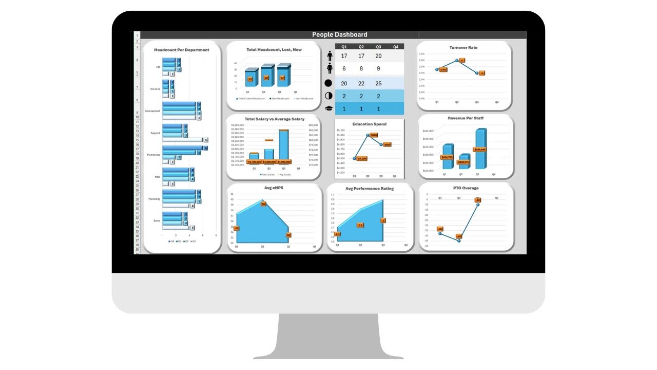
A people dashboard, also called a team health dashboard, brings your most important workforce data into a single view. It shows how engaged your people are, whether you are keeping them, whether teams are staffed properly, and how the workforce contributes to results, so leaders can make decisions based on facts rather than impressions.
The best part is that you do not need an HR department to have one. If you are a growing business without dedicated HR headcount, a simple people dashboard gives you a pulse on the team long before problems show up as resignations. And if you do have HR, a dashboard turns scattered reports into one clear picture for managers and executives.
This guide explains what a people dashboard is, why it matters, which metrics to include and how to calculate them, how to design one people will actually use, and which tools to build it with. It also includes a free dashboard builder that calculates the key numbers by department and flags where to look first.
What Is a People Dashboard?
A people dashboard is a visual tool that tracks workforce metrics over time, covering engagement, performance, staffing, time off, and the organization's overall health. It pulls data from the places it already lives, such as your HR system, payroll, time tracking, surveys, and performance reviews, into one view that becomes the single source of truth for workforce decisions.
A good one answers a handful of questions at a glance. Are our employees satisfied and engaged? Which teams or roles are at risk of losing people? Is every department adequately staffed? Are people taking the time off they need? And how does the workforce contribute to revenue and productivity?
Why Every Organization Needs One
Without a consolidated view, people decisions tend to be reactive. You find out a team is burned out when two people resign in the same month, or that a department is understaffed when deadlines start slipping. A people dashboard moves those signals earlier.
It improves engagement. Tracking satisfaction scores and eNPS over time shows morale trends while there is still time to respond.
It reduces turnover. Turnover by department reveals where people are leaving, so you can investigate causes before the pattern spreads.
It optimizes staffing. Headcount and workload data show where teams are stretched and where they have capacity.
It drives performance. Linking goal completion and productivity to business KPIs shows how team effort turns into results.
It supports strategic decisions. Hiring plans, promotions, and training investments are easier to justify when they are grounded in data.
The payoff is real. Gallup's research on employee engagement and business outcomes found that business units in the top quartile of engagement outperform those in the bottom quartile by 23% in profitability and 18% in productivity. You cannot improve engagement you are not measuring.
Key Metrics for a People Dashboard
An effective dashboard covers six areas: engagement, performance, workforce, time off, financial contribution, and culture. The table summarizes the core metrics and how to calculate them, and each area is explained below.
| Metric | How to calculate it | What it tells you |
|---|---|---|
| eNPS | Percent promoters (9 to 10) minus percent detractors (0 to 6) | Whether people would recommend working here |
| Turnover rate | Leavers divided by average headcount for the period | How quickly you are losing people |
| Net headcount change | Hires minus leavers | Whether the team is growing or shrinking |
| Average tenure | Average time employees have been with you | Experience depth and retention |
| PTO used | PTO days taken divided by PTO days available | Whether people are resting or running on empty |
| Absence rate | Unplanned absence days divided by (average headcount times workdays) | Health, morale, and scheduling pressure |
| Goal completion | Goals met divided by goals set | Whether teams deliver what they commit to |
| Revenue per employee | Revenue divided by average headcount | Workforce productivity and contribution |
1. Employee Engagement and Satisfaction
The employee Net Promoter Score (eNPS) asks how likely employees are to recommend the company as a place to work, on a scale of 0 to 10. Subtract the percentage of detractors, who answer 0 to 6, from the percentage of promoters, who answer 9 or 10. The result ranges from -100 to 100, and a negative score means more people would warn friends away than recommend you.
Round it out with a fuller engagement survey each quarter, covering motivation, purpose, and alignment, and short pulse surveys of a few questions more often to catch changes between them. Our guide to eNPS and employee survey software covers the tools.
2. Performance
Track average performance review scores at the individual and team level, goal completion rates showing the share of goals met, and the number of high-potential employees identified for growth and succession. Together they show whether teams are delivering and whether you are developing the next generation of leaders.
3. Workforce
Start with a headcount overview of employees, contractors, and open roles. Then track hires versus departures to see net change, headcount by department to understand where talent sits, turnover rate by department to spot retention risks, and average tenure to reveal experience gaps.
Turnover is calculated as the number of people who left during the period divided by the average headcount for that period. Tracking it by department matters because a healthy company-wide number can hide one team that is losing people fast.
4. Time Off and Leave
Compare PTO taken with PTO available. Unused leave can signal that people feel unable to step away, which is an early burnout warning, and in some places unused PTO also becomes a financial liability. Track the absence rate, unplanned absence days as a share of scheduled workdays, and watch sick and family leave trends for patterns that call for planning or support. Our free PTO tracker template is a simple place to start.
5. Financial and Productivity
Revenue per employee and profit per employee show how efficiently the workforce turns effort into results, and they are useful for planning hiring and budgets. Project completion rates add a view of how well teams manage time and deliver on commitments.
6. Culture and Team Health
Manager effectiveness, measured through 360-degree feedback, is one of the strongest drivers of engagement. Recognition data shows whether good work is being noticed, and collaboration measures, such as participation in cross-functional projects, show whether teams work together or in silos.
Free People Dashboard Builder
The builder below turns these metrics into a working dashboard. Enter one row per department for a period, such as a quarter, with starting headcount, hires, leavers, eNPS, average PTO taken and available, and unplanned absence days. Add company revenue and profit for the period.
The dashboard calculates headcount, turnover, company eNPS weighted by team size, PTO use, absence rate, and revenue and profit per employee. It flags departments with turnover of 15% or more in the period, a negative eNPS, PTO use under half, or absence of 3% or more. Those thresholds are simple starting points, so adjust your own after a few periods of data. Copy it to Excel, where every metric stays a live formula, and update it each period.
People Dashboard Builder
Enter one line per department for a period, such as a quarter. The builder calculates headcount change, turnover, eNPS, PTO usage, and absence rate for each team and the company, adds revenue and profit per employee, and flags where to look first. Copy it to Excel with live formulas to update each period, or print it for a leadership meeting. Nothing you enter is saved or sent anywhere.
| Department | Start headcount | Hires | Leavers | eNPS | Avg PTO days taken | PTO days available | Unplanned absence days |
|---|
Dashboard
| Department | Headcount now | Turnover | eNPS | PTO used | Absence rate | Flags |
|---|
In the example, Operations stands out immediately: four people left in one quarter, its eNPS is negative, and its team has used only 40% of available PTO. Those three signals together point to workload and morale problems worth addressing before more people leave.
Designing a High-Impact People Dashboard
A dashboard is only as valuable as the actions it drives. Five design principles make the difference.
Visual clarity. Use KPI tiles for the headline numbers, simple charts for trends, and color to flag problems. A leader should understand the state of the team in under a minute.
Segmentation. Break data down by department, role, location, or manager. Averages hide problems, and segments reveal them.
Current data. Connect the dashboard to your HR, payroll, time tracking, and survey tools where possible, so it reflects today rather than last quarter.
Comparison. Show each metric against prior periods, so leaders see direction as well as position. A turnover rate of 8% means something different if it was 4% last quarter.
Actionable alerts. Highlight red flags such as a falling eNPS, high unused PTO, or rising turnover, and assign an owner to follow up on each one.
How Leaders Can Use the Dashboard
Monitor trends. Review the dashboard monthly or quarterly to spot engagement declines, turnover spikes, or workload imbalances early.
Make better decisions. Use the data to allocate resources, plan hiring, and choose where to invest in training.
Communicate clearly. A shared visual view makes it easier to discuss people issues with executives and managers without debating whose impression is right.
Act proactively. Recognize high-performing teams, encourage people who have not taken time off to use it, and address retention risks before they become resignations.
Align the workforce with goals. Connect each team's metrics to business objectives so everyone can see how their work contributes.
Tools to Build Your People Dashboard
You do not need expensive software to start. A spreadsheet in Excel or Google Sheets is enough for a small business, and our Lever One toolkit includes a ready-made people dashboard to get you started. Our guide to building a KPI tracker in Excel shows the techniques.
As you approach 100 employees, dedicated tools become worth considering. HR information systems such as BambooHR, Workday, and SAP SuccessFactors hold employee records and can report on headcount and turnover. Survey and engagement tools such as Culture Amp and Qualtrics run eNPS and engagement surveys. Business intelligence tools such as Power BI, Tableau, and Looker turn data from several systems into interactive dashboards. I have personally used BambooHR and Power BI, and the pairing works well.
A hybrid approach is often best: collect data in your HR system and survey tools, and use a BI tool or spreadsheet to bring it together and visualize it.
If you want much of this data to exist in one place from the start, Updoot is business management software that combines time tracking, PTO, performance reviews, goals, and an employee dashboard, so attendance, time off, and performance data feed your people metrics without manual exports. It costs $5 per user per month, and you can start a free trial anytime.
Final Thoughts
A people dashboard is a powerful way to see, understand, and act on workforce data. By tracking engagement, headcount and turnover, PTO use, performance, and financial contribution, leaders can make proactive decisions that improve team health, strengthen retention, and raise productivity.
What gets measured gets managed. A clear people dashboard makes sure your most valuable asset, your people, is supported, recognized, and empowered, whether or not you have an HR team yet.
Sources
Engagement performance figures come from Gallup, How Employee Engagement Drives Growth. Department figures in the builder are illustrative.
Opens in Google Drive. View and download for free.
Related Reading
Best eNPS and Employee Survey Software for Small Business →
The Employee Dashboard: One Place to Clock In, Work, and Align →
Frequently Asked Questions About People Dashboards
What is a people dashboard?
A people dashboard is a visual view of workforce metrics, such as engagement, turnover, headcount, PTO use, performance, and revenue per employee, that helps leaders spot problems early and make data-driven decisions.
Can a small business build a people dashboard without HR?
Yes. A spreadsheet with headcount, hires and leavers, a simple eNPS survey, PTO records, and revenue is enough to start, and it gives owners a pulse on the team before they have dedicated HR staff.
What metrics should a people dashboard include?
Core metrics are eNPS, turnover rate by department, headcount and net change, average tenure, PTO used versus available, absence rate, goal completion, and revenue and profit per employee.
How do you calculate employee turnover rate?
Divide the number of employees who left during the period by the average headcount for the period. Average headcount is the starting headcount plus the ending headcount, divided by two.
How is eNPS calculated?
Ask employees how likely they are to recommend the company as a place to work on a 0 to 10 scale, then subtract the percentage of detractors (0 to 6) from the percentage of promoters (9 or 10).
Why track unused PTO?
Low PTO use can be an early sign of burnout or workload pressure, and unused balances can also create a financial liability depending on your policy and location.
How often should a people dashboard be reviewed?
Monthly or quarterly works for most businesses. Review trends against prior periods and assign an owner to follow up on each red flag.