
How to Create Excel Charts

Charts are powerful tools in Excel that help visualize data, making it easier to identify trends, patterns, and outliers. Whether you're preparing a report, analyzing data, or presenting findings, charts can transform raw numbers into insightful visuals. This article will guide you through the different types of charts available in Excel and provide practical examples to help you choose and create the most effective chart for your data.
1. Column Charts
Column charts are ideal for comparing data across categories. They display data using vertical bars and are useful for visualizing changes over time or differences between groups.
Types:
- Clustered Column Chart: Compares multiple data series within categories.
- Stacked Column Chart: Shows the total value of each category with the data series stacked on top of each other.
- 100% Stacked Column Chart: Displays the percentage of each series in relation to the total.
Example: Comparing Sales by Region
Imagine you have sales data for different regions and months:
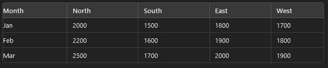
To create a clustered column chart:
- Select the data range.
- Go to the Insert tab.
- Choose Column Chart from the Charts group and select Clustered Column.
This chart will visually compare sales across different regions for each month.
2. Line Charts
Line charts are perfect for showing trends over time. They use lines to connect data points, highlighting changes and trends.
Types:
- Line Chart: Displays data points connected by lines.
- Stacked Line Chart: Shows multiple lines stacked on top of each other.
- 100% Stacked Line Chart: Displays the percentage contribution of each series over time.
Example: Tracking Monthly Website Traffic
Suppose you have monthly website traffic data:
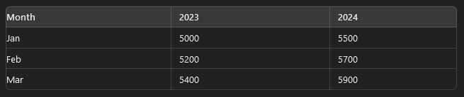
To create a line chart:
- Select the data range.
- Go to the Insert tab.
- Choose Line Chart from the Charts group and select the desired line chart type.
This chart will show how website traffic has changed over the months for the two years.
3. Pie Charts
Pie charts are useful for showing the proportion of each category relative to the whole. They display data as slices of a circle, with each slice representing a category's percentage of the total.
Types:
- Pie Chart: Basic pie chart displaying proportions.
- Donut Chart: Similar to a pie chart but with a hole in the middle, allowing for additional data to be displayed.
Example: Market Share of Different Brands
If you have data on the market share of brands:
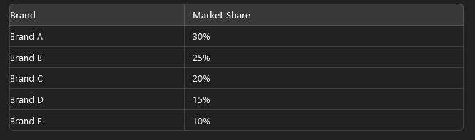
To create a pie chart:
- Select the data range.
- Go to the Insert tab.
- Choose Pie Chart from the Charts group and select the desired pie chart type.
This chart will clearly show the percentage share of each brand in the market.
4. Bar Charts
Bar charts are similar to column charts but use horizontal bars. They are useful for comparing data across categories when category names are long or when you want to display data in a more readable format.
Types:
- Clustered Bar Chart: Compares multiple data series within categories using horizontal bars.
- Stacked Bar Chart: Shows the total value of each category with data series stacked on top of each other.
- 100% Stacked Bar Chart: Displays the percentage contribution of each series relative to the total.
Example: Comparing Employee Performance
Suppose you have performance ratings for different employees:
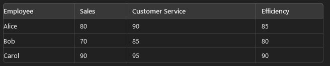
To create a clustered bar chart:
- Select the data range.
- Go to the Insert tab.
- Choose Bar Chart from the Charts group and select the desired bar chart type.
This chart will allow you to compare performance ratings across different employees easily.
5. Scatter Charts
Scatter charts are used to display values for two different variables, showing how they correlate. They plot data points on a Cartesian plane.
Types:
- Scatter Plot: Shows individual data points and the relationship between two variables.
- Scatter Plot with Lines: Adds lines connecting the data points to show trends.
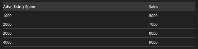
Example: Analyzing Relationship Between Advertising Spend and Sales
If you have data on advertising spend and sales:
To create a scatter chart:
- Select the data range.
- Go to the Insert tab.
- Choose Scatter Chart from the Charts group and select the desired scatter chart type.
This chart will help visualize the relationship between advertising spend and sales performance.
6. Combo Charts
Combo charts combine two or more chart types into a single chart. They are useful when you need to display different types of data or highlight different aspects of your data.
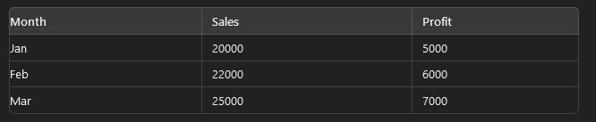
Example: Combining Sales and Profit Data
Suppose you have monthly sales and profit data:
To create a combo chart:
- Select the data range.
- Go to the Insert tab.
- Choose Combo Chart from the Charts group and select Create Custom Combo Chart.
You can choose different chart types for sales and profit (e.g., column for sales and line for profit) to visualize them together.
7. Bubble Charts
Bubble charts are an extension of scatter charts, adding a third dimension to the data using bubble sizes.
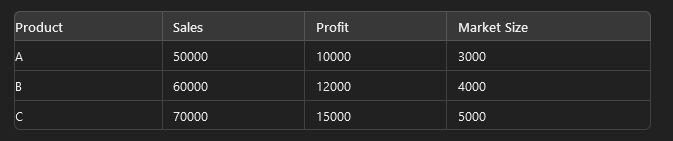
Example: Visualizing Sales, Profit, and Market Size
If you have data on sales, profit, and market size:
To create a bubble chart:
- Select the data range.
- Go to the Insert tab.
- Choose Bubble Chart from the Charts group.
This chart will help visualize the relationship between sales, profit, and market size, with bubble sizes representing market size.