
How to Create a Dynamic Butterfly Chart in Excel
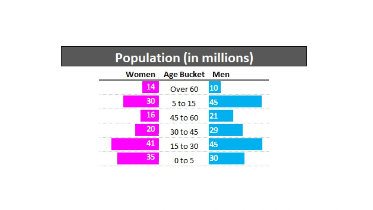
Follow this step by step article and video on how to build a butterfly chart in Excel, sometimes known as a tornado or pyramid chart. A butterfly chart in Excel is one of the most visually powerful comparison tools you can build without leaving your spreadsheet. Also called a population pyramid or tornado chart, it displays two datasets mirrored against each other on a horizontal axis so the reader can instantly see where one group is larger, smaller, or roughly equal to the other.
If you have ever looked at a demographic breakdown, a before and after comparison, or a side by side product analysis and wished you had a cleaner way to visualize it, a butterfly chart is exactly what you need. This guide walks you through every step of building one in Excel from scratch, including the conditional formatting approach that produces a dynamic chart that updates automatically when your data changes.
What Is a Butterfly Chart in Excel?
A butterfly chart gets its name from its shape. Two horizontal bar charts are placed back to back, sharing a central axis of labels. One set of bars extends to the left. The other extends to the right. The result looks like wings of a butterfly, with the labels running down the center like the body.
The design is deliberate. By mirroring the bars against each other with shared labels in the center, the chart forces a direct visual comparison at every row. The reader does not have to look back and forth between two separate charts or mentally subtract one value from another. The difference is visible immediately in the relative length of the bars.
Butterfly charts are particularly effective when your data has a natural paired structure where every category has exactly two values you want to compare. Age groups with male and female populations. Months with two years of revenue. Survey questions with responses from two different customer segments. Any situation where you have two groups and multiple categories works well in a butterfly chart.
What Are Butterfly Charts Used For?
Understanding the use cases helps you decide whether a butterfly chart is the right visualization for your specific data before you invest time in building it.
Demographic analysis is the most classic use of the butterfly chart, which is why it is also called a population pyramid. Age groups run down the center axis and the bars extend left for one gender and right for the other. At a glance you can see whether a population skews young or old, whether there are gender imbalances in specific age groups, and how the overall demographic structure compares to another country, region, or time period. Public health researchers, government planners, and marketers all use this format to understand who their audience is and how it is changing.
Sales comparisons are a natural fit for butterfly charts in business contexts. If you have two products, two sales regions, two store locations, or two time periods, a butterfly chart shows their relative performance across every category you track simultaneously. A sales manager comparing Q1 versus Q2 performance by product category can see in a single chart which categories grew, which shrank, and by how much, without toggling between multiple charts or reading a table of numbers.
Survey data analysis benefits enormously from the butterfly format when you are comparing responses from two distinct groups. Customer satisfaction scores from enterprise clients on the left, small business clients on the right, with each question running down the center axis. Market research comparing brand perception between two demographics. Employee engagement survey results from two departments or two office locations. The butterfly chart makes the similarities and differences between groups immediately visible in a way that a standard bar chart or table cannot match.
Before and after comparisons work particularly well when you want to show how a metric changed across multiple categories as a result of a specific intervention, campaign, or time period. Marketing teams use this to show campaign impact. Operations teams use it to show the effect of a process improvement. Finance teams use it to compare budget to actual across multiple line items simultaneously.
Competitive analysis is another strong use case. If you are comparing your business to a competitor across multiple dimensions such as pricing, market share by region, customer ratings by product category, or feature adoption rates, a butterfly chart presents all of those comparisons in a single unified visual that is far more persuasive than a table of numbers.
What You Need Before You Start Building a Butterfly Chart
Before building the butterfly chart, you need your data organized correctly. The structure is straightforward but important to get right before you start applying formatting.
You need three columns. The first column contains your category labels, which will run down the center of the finished chart. These might be age groups, months, product categories, survey questions, or any other dimension you are comparing across. The second column contains the values for your first group, which will become the left side bars. The third column contains the values for your second group, which will become the right side bars.
Make sure your data is complete with no empty rows in the middle of the range and that the values in both data columns are in the same units. If one column is in thousands and the other is in millions, your bars will be wildly disproportionate and the chart will be misleading.
If your values are very large numbers, such as actual population counts in the hundreds of millions, consider converting them to a more readable unit before building the chart. Dividing by one million and displaying values like 12.4 rather than 12,400,000 makes the chart significantly cleaner and easier to read.
Step 1: Prepare and Convert Your Data
If your data is in large raw numbers, the first step is converting it to a more readable scale. This is optional but strongly recommended for any dataset where the raw numbers are difficult to read at a glance.
To convert population data to millions, create a new column for each data group and use a simple division formula. For the left group in column A starting at row 2, enter =A2/1000000 in the new column. For the right group in column B, enter =B2/1000000 in its new column. Drag the fill handle at the bottom right corner of each formula cell down through all rows to apply the conversion to every row in your dataset.
After converting, adjust the decimal places to show one or two decimal places for clean presentation. Select your converted data columns, press Ctrl+1 to open Format Cells, go to the Number tab, and set decimal places to 1. This gives you values like 8.3 rather than 8.347291 which is cleaner in the finished chart.
If your data is already in a readable scale such as percentages, scores out of 100, or values under a few thousand, skip the conversion and work directly with your original data.
At this point your spreadsheet should have three main columns in play: your category labels, your left group values in the readable scale, and your right group values in the readable scale. These three columns are the foundation everything else builds on.
Step 2: Apply Conditional Formatting Data Bars to the Left Group
The butterfly chart in Excel is built using conditional formatting data bars rather than a traditional chart object. This approach has a significant advantage: the result is embedded directly in your spreadsheet cells, updates automatically when data changes, and can be positioned and formatted with the same flexibility as any other cell content.
Start with the left group, which will display bars extending from right to left to create the left wing of the butterfly.
Select all the value cells in your left group column, not including the header. Go to the Home tab, click Conditional Formatting, hover over Data Bars, and click More Rules at the bottom of the submenu. This opens the New Formatting Rule dialog.
In this dialog, check the box that says Show Bar Only. This hides the number in the cell and displays only the bar itself, which is what you want for the chart. Without checking this box you will see both the number and the bar overlaid on each other, which looks cluttered.
Set the Minimum value type to Number and enter 0. Set the Maximum value type to Number and enter the maximum value in your dataset for this group, or a round number slightly above the maximum such as 50 if your largest value is 47. Using a fixed maximum rather than Automatic is critical because it ensures the bar lengths are proportional across both groups. If you use Automatic, Excel sets the maximum independently for each group and the bars become incomparable.
Under Bar Appearance, click the Fill Color dropdown and choose the color you want for the left group. For demographic charts, pink or a similar warm color is conventional for female data. For other chart types, choose any color that fits your design.
Under Bar Direction, change the setting from Left to Right to Right to Left. This is the key setting that creates the butterfly effect. Instead of bars growing from the left edge of the cell outward to the right, they will grow from the right edge of the cell outward to the left, pointing toward the center of your chart where the labels will sit.
Click OK to apply the formatting. Your left group column should now show colored bars that extend from right to left, with longer bars for larger values and shorter bars for smaller values.
Step 3: Apply Conditional Formatting Data Bars to the Right Group
Repeat the data bar process for the right group with two important differences: the color should be different from the left group to make the two sides visually distinct, and the bar direction should be Left to Right rather than Right to Left.
Select all the value cells in your right group column. Go to Home, Conditional Formatting, Data Bars, More Rules. Check Show Bar Only. Set Minimum to Number, 0. Set Maximum to Number, and use the same maximum value you used for the left group. This is essential. Both groups must use the same maximum value or the bar lengths will not be comparable.
Choose your color for the right group. Blue is conventional for male data in demographic charts. For business data, choose a color that creates clear visual contrast with the left group color while fitting your overall design.
Set Bar Direction to Left to Right. Click OK.
Your right group column now shows bars extending from left to right. When you look at the two data columns together with the category labels in the middle, you should already see the butterfly shape forming.
Step 4: Create Linked Pictures for the Data Values
The conditional formatting approach hides the actual numbers in the cells so only bars show, which creates a clean visual but removes the specific values from view. To show the numbers alongside the bars without disrupting the bar formatting, you can display them using linked pictures placed outside the main chart area.
A linked picture in Excel is an image that is dynamically connected to a cell range. It displays whatever is currently in those cells and updates automatically when the cell content changes. This means you can show your data values in a styled format elsewhere on the worksheet without affecting the cells that contain the bars.
To create a linked picture for the left group values, first select the range of cells containing your original or converted numeric values for the left group. Press Ctrl+C to copy. Click on an empty cell area where you want the numbers to appear, ideally directly alongside the bar column. Right-click and look for Paste Special. In Excel 2019 and Microsoft 365, you can also go to Home, Paste dropdown, and select Linked Picture or Picture.
The linked picture will appear as an image that you can move and resize independently of the cell grid. Position it so the numbers appear adjacent to the bars they correspond to.
Format the text in the source cells that the linked picture is displaying. Make the font bold and consider changing the font color to white if the cells have a colored background, or to dark gray for a clean look on a white background. Since the linked picture reflects the source cells, any formatting changes you make to the source cells immediately update in the picture.
Repeat the process for the right group values.
Step 5: Position and Arrange the Three Sections
At this point you have three visual elements to position: the left group bars with their linked value display, the center category labels, and the right group bars with their linked value display.
The goal is to arrange these so the labels sit exactly in the center with bars extending symmetrically to the left and right. This requires some column width adjustment and alignment tuning to get right.
Column widths: The left bar column and the right bar column should be the same width. Unequal column widths will make one side of the butterfly look wider than the other even when the values are equal, which misrepresents the data. Select both columns, right-click, choose Column Width, and enter the same value for both.
Label alignment: The center column containing your category labels should be center-aligned. Select the label cells and click the center alignment button in the Home tab. This ensures the labels sit symmetrically between the two bar columns.
Header alignment: The header for the left group should be right-aligned so it reads naturally above the left-pointing bars. The header for the right group should be left-aligned for the same reason. This mirrors the directionality of the bars and makes the chart easier to scan.
Spacing: Consider adding a small amount of column width to the center label column to create visual breathing room between the two sets of bars. Bars that run right up to the edge of the label column without any space look cramped.
Step 6: Add Borders and Final Formatting
Borders and background formatting transform a functional data display into a polished professional chart. The goal is to use borders to create structure without adding visual clutter.
Select your entire chart area including all three columns and all data rows. Press Ctrl+1 to open Format Cells and go to the Border tab. Apply a light gray horizontal border between each row. This creates a subtle grid that guides the eye across each category row without the heaviness of a full black border grid.
For the header row, apply a slightly thicker or darker bottom border to create clear visual separation between the headers and the data. This is a small detail that significantly improves the overall professionalism of the finished chart.
For the outer boundary of the entire chart, apply a medium weight border around the full perimeter to box the chart in as a distinct element on the worksheet.
Consider adding a subtle background color to alternating rows, either using conditional formatting with the MOD ROW formula approach or manually applied fill colors. Alternating row shading makes it easier to follow a specific row across the full width of the chart, which is particularly helpful in charts with many categories.
Add a clear title above the chart that explains what is being compared and over what time period or scope. A good butterfly chart title answers three questions: what is being compared, what the two groups are, and what time period or context applies.
Step 7: Test the Dynamic Update
One of the main advantages of the conditional formatting approach over a static image chart is that the butterfly chart updates automatically when your underlying data changes. Before finalizing, test this by changing a few values in your source data and confirming that the bars adjust proportionally and the linked pictures update to reflect the new numbers.
If your linked pictures are not updating automatically, check that the paste option you used was Linked Picture rather than Picture. A static picture paste will not update with data changes. If the bars are not proportional after a data change, verify that both groups are using the same fixed maximum value in their conditional formatting rules rather than Automatic.
Common Butterfly Chart Mistakes to Avoid
Using different maximum values for the two groups. This is the most common mistake and the most damaging to the chart's integrity. When the left group maximum is set to 50 and the right group maximum is set to 80, a bar representing 40 looks the same length on both sides even though 40 represents 80% of capacity on the left and only 50% on the right. Always use the same maximum for both groups.
Not centering the label column. Labels that are left or right aligned in the center column look like they belong to one side of the chart rather than serving as the shared axis. Center alignment is essential for the butterfly shape to read correctly.
Unequal column widths. Even perfectly calibrated bars will look disproportionate if the columns they sit in have different widths. Check that both bar columns have identical widths after you complete the formatting.
Too many categories. A butterfly chart with 30 or more rows becomes hard to read because the individual bars are too thin to compare visually. If you have many categories, consider grouping them into fewer, broader categories or using a table with conditional formatting for dense data.
Missing a title and legend. A butterfly chart without a title and clear labels for the left and right groups forces the reader to guess what they are looking at. Always include a title that describes the comparison and clear headers or a legend that identifies which color represents which group.
Frequently Asked Questions
What is a butterfly chart in Excel?
A butterfly chart in Excel is a visualization that displays two datasets as mirrored horizontal bars sharing a central axis of category labels. One set of bars extends to the left and the other extends to the right, creating a shape that resembles butterfly wings. It is also called a population pyramid when used for demographic data or a tornado chart when used for sensitivity analysis. In Excel it is most commonly built using conditional formatting data bars rather than a traditional chart object.
What is a butterfly chart used for?
Butterfly charts are used to compare two groups across multiple categories simultaneously. Common applications include comparing male and female population distributions by age group, comparing sales performance across two time periods or regions, analyzing survey responses from two different demographics, and displaying before and after comparisons across multiple metrics. The mirrored bar design makes differences and similarities between the two groups immediately visible without requiring the reader to calculate or mentally compare separate charts.
How do you make a butterfly chart in Excel?
Build a butterfly chart in Excel by organizing your data in three columns: category labels in the center column, left group values in the left column, and right group values in the right column. Apply conditional formatting data bars to the left column with direction set to Right to Left, and apply data bars to the right column with direction set to Left to Right. Use the same fixed maximum value for both groups to ensure the bars are proportional. Adjust column widths to be equal, center align the labels, and add borders and headers to complete the chart.
What is the difference between a butterfly chart and a tornado chart?
Both display two sets of horizontal bars mirrored against each other. The difference is primarily in the use case and sorting. A tornado chart is typically used in financial modeling and sensitivity analysis where variables are sorted from largest impact at the top to smallest at the bottom, creating a tornado shape that narrows as it descends. A butterfly chart is typically used for demographic or comparative data where the categories have a natural order such as age groups or time periods rather than being sorted by impact magnitude.
Can you make a butterfly chart in Excel without conditional formatting?
Yes. An alternative approach uses a standard Excel bar chart with one dataset formatted as negative values so its bars extend in the opposite direction from the other dataset. This method produces a chart object rather than a cell-based visualization. The conditional formatting approach described in this article is generally preferred for its dynamic update behavior and the flexibility to embed it directly in a worksheet layout, but the bar chart method is a viable alternative particularly for users who are more comfortable with Excel charts than with conditional formatting.
Why are my butterfly chart bars not the same scale on both sides?
This happens when the two conditional formatting rules are using different maximum values. Each rule independently sets the scale for its bars, so if the left group maximum is set to Automatic and the right group maximum is set to 50, bars of equal value will display at different lengths. Fix this by opening each conditional formatting rule through Home, Conditional Formatting, Manage Rules, and setting both maximum values to the same fixed number.
How do I add numbers to a butterfly chart in Excel?
The Show Bar Only option in the conditional formatting data bar settings hides the numbers to display only the bars. To show numbers alongside the bars, uncheck Show Bar Only to display both, though this can look cluttered. The cleaner approach is to create linked pictures of the value cells and position them adjacent to the bar columns, which displays the numbers in a separate area that you can format independently without affecting the bars.