
Pivot Tables in Excel: What they are and how to use them
.png)
If you're new to Excel, PivotTables might sound intimidating but they are one of the most powerful tools in the program for summarizing and analyzing data. Whether you're managing sales figures, budgets, customer lists, or inventory, learning how to use PivotTables will dramatically boost your productivity.
In this guide, we’ll break down what a PivotTable is, how to create one, and explore all the little features that make them so versatile and useful. By the end, you’ll be able to confidently slice, dice, and analyze your data like a pro. Side note, outside of Excel I see it spelled Pivot Table but inside Excel, it's actually one word.
What is a PivotTable in Excel?
A PivotTable is an Excel feature that lets you quickly summarize large sets of data. You can group, filter, count, total, or average data without writing formulas. PivotTables are especially useful when your raw data is structured in a table with rows and columns, like a list of transactions or a customer database.
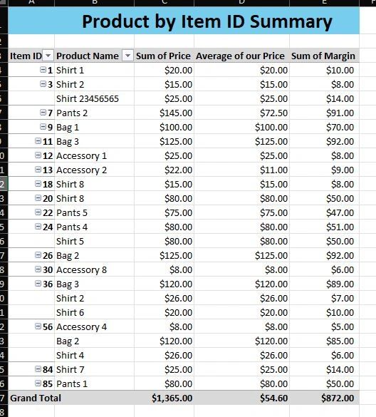
Think of it like a dynamic report builder. You choose what you want to see, and Excel handles the math and layout. In the image below, you see Item ID on the far left. This is what a pivot table looks like when you put something like Item ID in the rows to group by. If you didn't use a pivot table, you would likely have a gigantic list of Item IDs and no way to summarize.
Before You Begin: Prepare Your Data
To use PivotTables effectively, your data should meet these conditions:
- Column headers: Each column must have a header (like “Date,” “Region,” or “Sales”).
- No blank rows or columns: Your data should be in one continuous table.
- Consistent data types: Don’t mix numbers and text in the same column.
Tip: Convert your data into an Excel Table (Ctrl + T). It helps PivotTables stay connected to the data as it grows.
How to Create a PivotTable
- Click anywhere inside your data.
- Go to the Insert tab and click PivotTable.
- In the popup, choose:
- The data range (automatically selected if you clicked in a table)
- Whether to place the PivotTable in a new worksheet or existing worksheet
- Click OK.
You’ll now see a blank PivotTable and a PivotTable Fields pane on the right.
Understanding the Pivot Table Layout
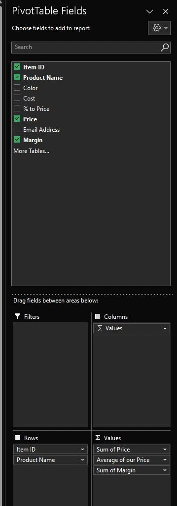
The Fields pane is where the magic happens. You'll see all your column headers listed as fields. You can drag them into one of four areas. My image below is the example from the video above and the Xpert course lesson 77.
- Rows – What you want to group by (e.g., Region, Product)
- Columns – Additional grouping across the top (e.g., Month)
- Values – What you want to measure (e.g., Sales, Quantity)
- Filters – Criteria to narrow down what shows in the PivotTable
Example: Summarize Sales by Region
Let’s say you have a table with the following columns: Date, Region, Salesperson, Sales.
Here’s how to use a PivotTable to see total sales by region:
- Drag Region into the Rows area.
- Drag Sales into the Values area.
- Excel will automatically sum the Sales column.
And voilà! You’ve just created a PivotTable.
Customizing Pivot Tables: Key Features and Options
Here’s where you can take PivotTables from good to great. Let’s explore the options:
1. Change Calculation Type
By default, Excel sums numerical values. But you can change this:
- Click the small drop-down arrow next to the value in the PivotTable Fields pane.
- Select Value Field Settings.
- Choose from: Sum, Count, Average, Max, Min, StdDev, etc.
Count is useful for non-numerical data (e.g., how many orders per customer).
2. Format Numbers
To format values (like adding $ or commas):
- Right-click a number in the PivotTable.
- Choose Number Format.
- Pick the appropriate category (Currency, Percentage, etc.).
3. Sort and Filter
You can sort and filter just like in normal Excel:
- Click the dropdown in a row or column label.
- Sort A to Z or Z to A.
- Use checkboxes to filter specific items.
Filters help narrow down the view, for example, showing sales for only the Midwest.
4. Add Multiple Fields
You can drag more than one field into Rows or Columns.
- For example, drag Region and Salesperson into Rows.
- Excel will create a hierarchy: Region > Salesperson.
This is great for drilling into details.
5. Group Data
You can group:
- Dates: Right-click a date field > Group > Choose to group by Month, Quarter, or Year.
- Numbers: Group sales into ranges (e.g., 0–1000, 1001–2000).
- Text: Manually group selected items (Ctrl + Click > Right-click > Group).
6. Show Percentages Instead of Totals
Want to see what percentage each item contributes?
- Right-click a value > Show Values As > Choose:
- % of Grand Total
- % of Row Total
- % Difference From, and more
This is perfect for comparing proportions.
7. PivotTable Design Options
Go to the Design tab on the ribbon to:
- Apply different styles
- Add or remove totals and subtotals
- Change layout (Compact, Outline, Tabular)
Try switching to Tabular Form for easier reading and copying.
8. Refresh When Data Changes
If your source data updates, you must refresh the PivotTable:
- Right-click the PivotTable > Refresh
- Or use the Refresh All button on the Data tab
If you use an Excel Table as your source, it auto-expands when you add new rows.
9. Slicers: Visual Filters
Slicers make filtering easier with clickable buttons:
- Click anywhere in the PivotTable
- Go to Insert > Slicer
- Choose fields (e.g., Region, Salesperson)
Slicers let you filter your PivotTable with a single click.
10. PivotCharts: Graph Your PivotTable
To visualize the data:
- Click anywhere in the PivotTable
- Go to Insert > PivotChart
- Choose the chart type (Column, Line, Pie, etc.)
When you filter the PivotTable, the chart updates too!
11. Calculated Fields: Create Your Own Metrics
Calculated fields let you add custom formulas to your PivotTable without editing your original data.
For example, let’s say you have columns for Revenue and Cost, and you want to create a new column that shows Profit.
How to Add a Calculated Field:
- Click anywhere in the PivotTable.
- Go to the PivotTable Analyze (or Analyze) tab on the ribbon.
- Click Fields, Items & Sets > Calculated Field.
- In the popup:
- Name your new field (e.g., "Profit").
- In the Formula box, type your formula using field names:
= Revenue - Cost
- Click Add, then OK.
Your new calculated field will appear in the Values area automatically.
Tips and Nuances:
- You must use exact field names from your PivotTable in the formula.
- Calculated fields apply the formula row by row in the PivotTable, not on totals.
- You can use basic arithmetic:
+,-,*,/. - Calculated fields can’t use cell references—they only work with PivotTable fields.
Example Use Cases:
Profit Margin = (Revenue - Cost) / RevenueCommission = Sales * 0.05Unit Price = Revenue / Quantity
Editing or Deleting a Calculated Field:
- Go back to Fields, Items & Sets > Calculated Field
- Select the field from the Name dropdown.
- Make edits and click Modify, or click Delete to remove it.
Adding calculated fields gives you even more power to extract insights from your data without altering your source table or adding helper columns.
Common Mistakes to Avoid Using Pivot Tables
- Merging cells in source data: This breaks the PivotTable.
- Blank headers: Every column needs a unique, non-empty header.
- Not refreshing: Always refresh after editing your source data.
- Using too much data: PivotTables can slow down if your data set is huge—consider filtering your source data first.
Pro Tips for Going Further
- Use calculated fields to add custom formulas to your PivotTable
- Use multiple PivotTables on the same dataset to answer different questions
- Explore Power Pivot for even more advanced analysis, especially for large datasets or data models
PivotTables may feel like magic at first, and that’s because they kind of are. They take the pain out of data analysis and let you focus on insights. Once you get comfortable with dragging and dropping fields, filtering, and customizing views, you’ll find PivotTables indispensable in your Excel toolkit.
If you’re just getting started with Excel, PivotTables are one of the best ways to impress your boss, understand your data, and make smarter decisions fast.
Want to practice PivotTables with guided examples? Check out my Excel Xecutor and Excel Survival courses to go from beginner to confident user in no time.